Sacred Waters
- Client
- Sacred Waters
- Role
- Creative Direction, Naming, Brand Identity, Packaging
- Year
- 2024
Sacred Waters is a tea brand built around the idea of tea as a daily oasis, a moment of escape and transformation. The project included naming, brand identity, packaging for six products, and applications across advertising and digital touchpoints.
Creative Direction
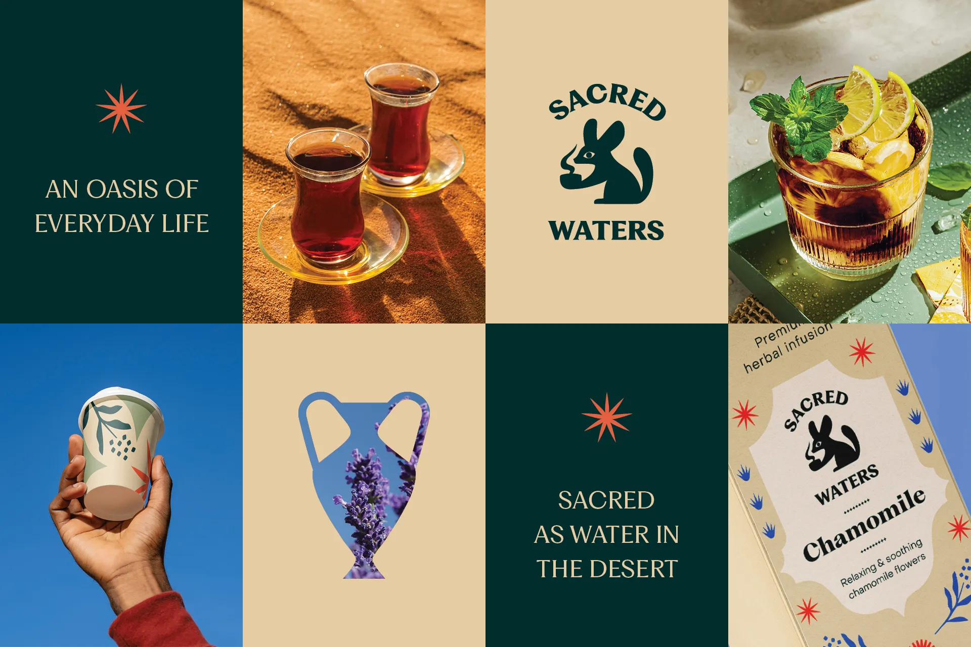
The creative direction began with the experience of drinking tea: a small moment of calm where everything feels right. This led to the idea of tea as something precious, even sacred, and ultimately to the name Sacred Waters.
The idea of a daily oasis grew from there, set in the desert, where water is truly precious.
Logo: The Fennec Fox
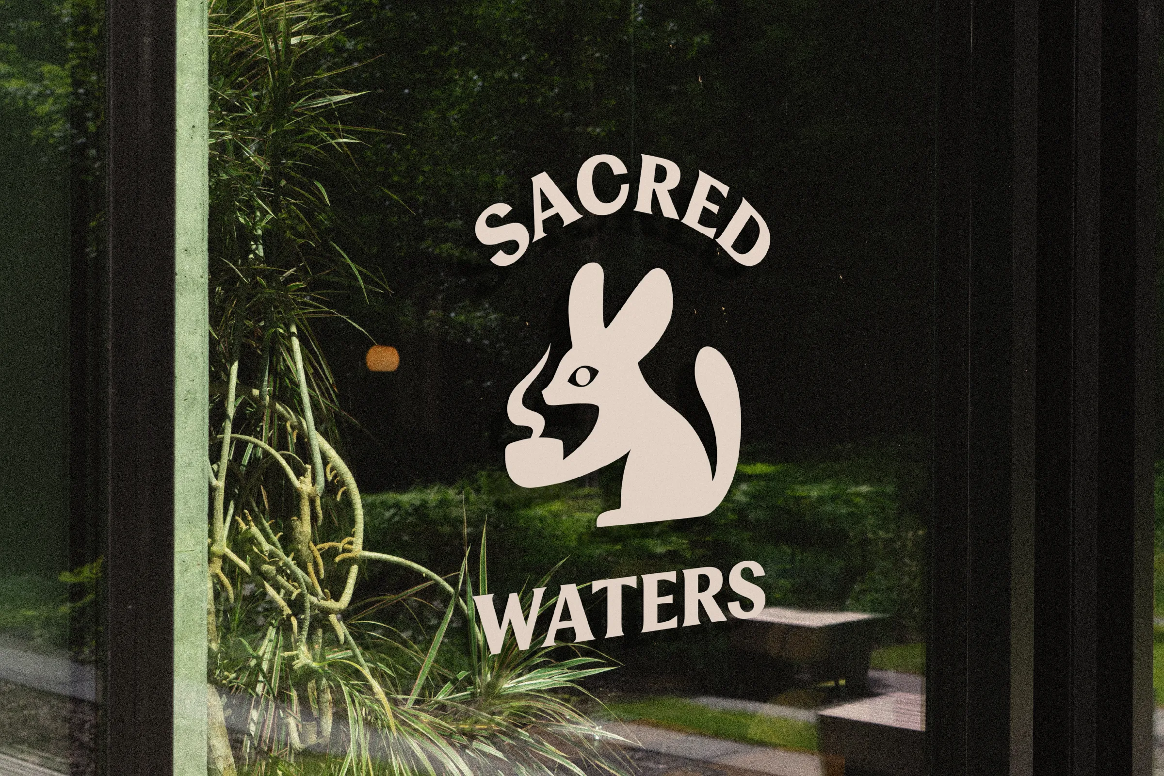
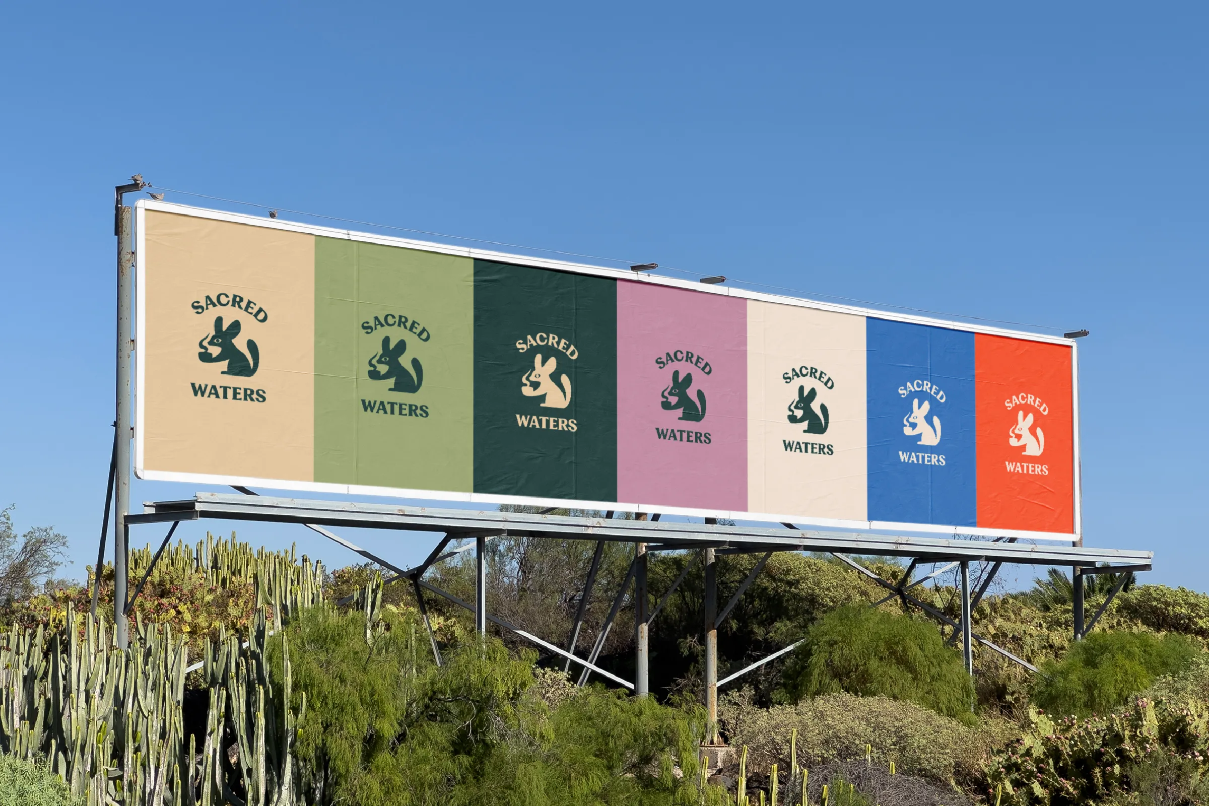
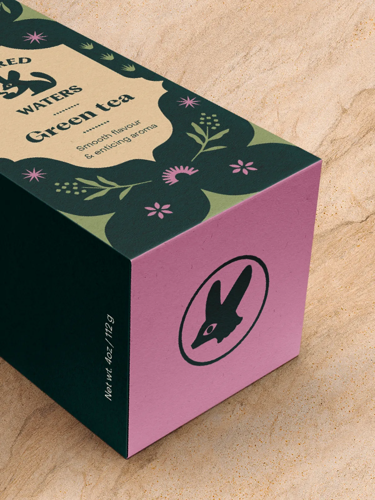
Rather than relying on familiar tea symbols, I chose the fennec fox as the brand emblem: a desert animal adapted to life where water is scarce.
Visual Language
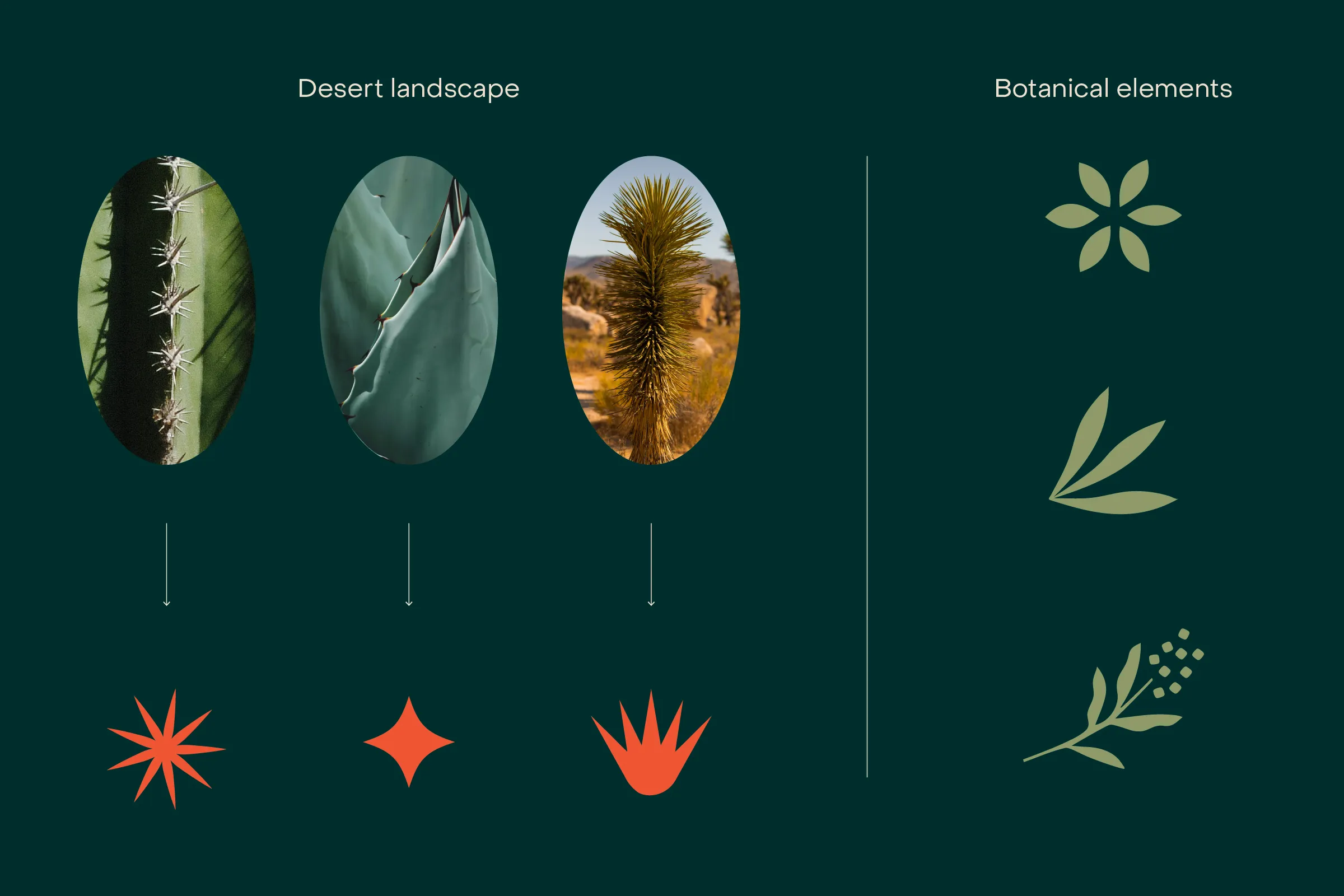
The visual system is rooted in the desert, with botanical elements that tie it back to tea.
Typography & Color
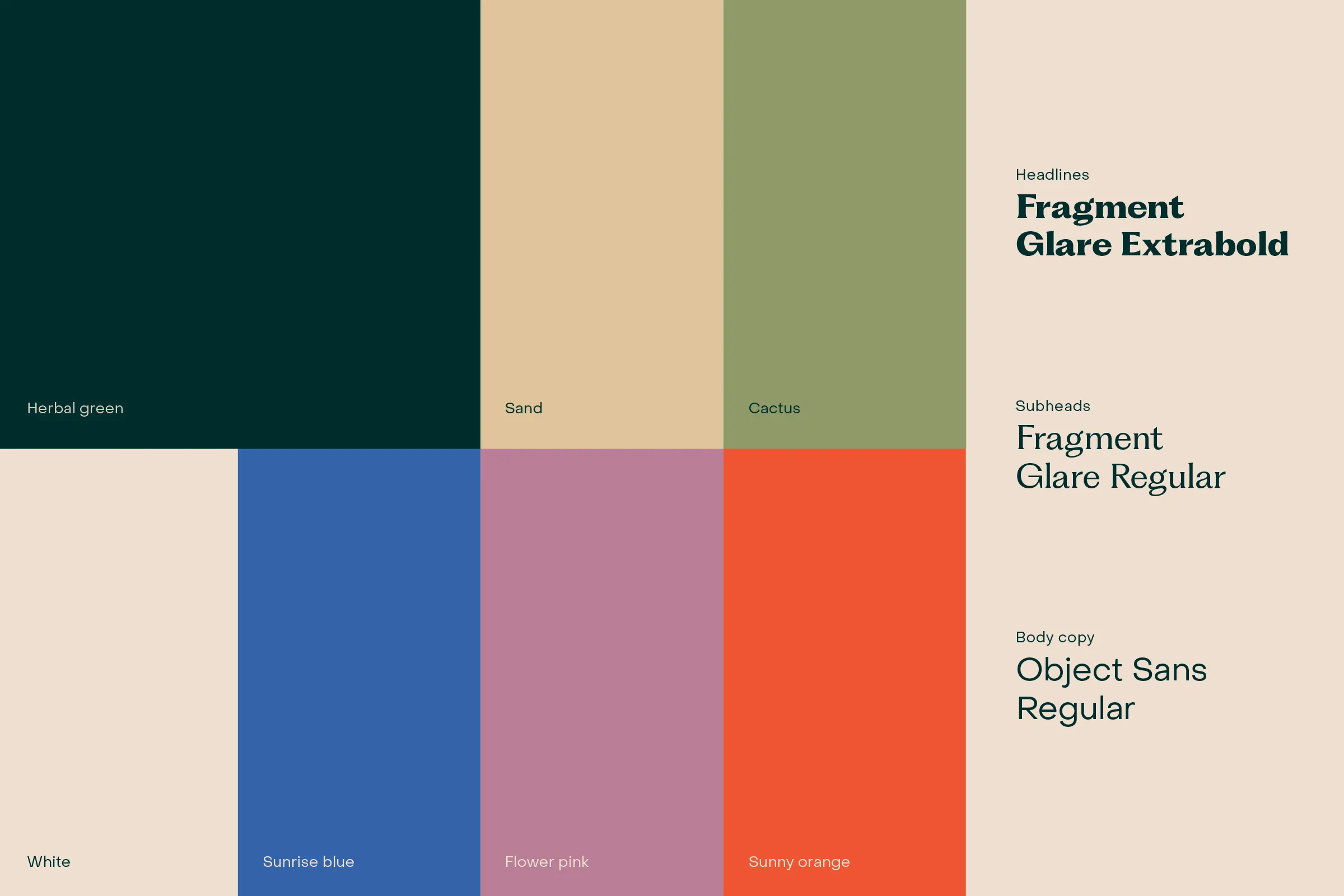
Fragment gives the identity its character, while Object Sans keeps functional information clear. The palette draws from the colors of the desert landscape.
Packaging
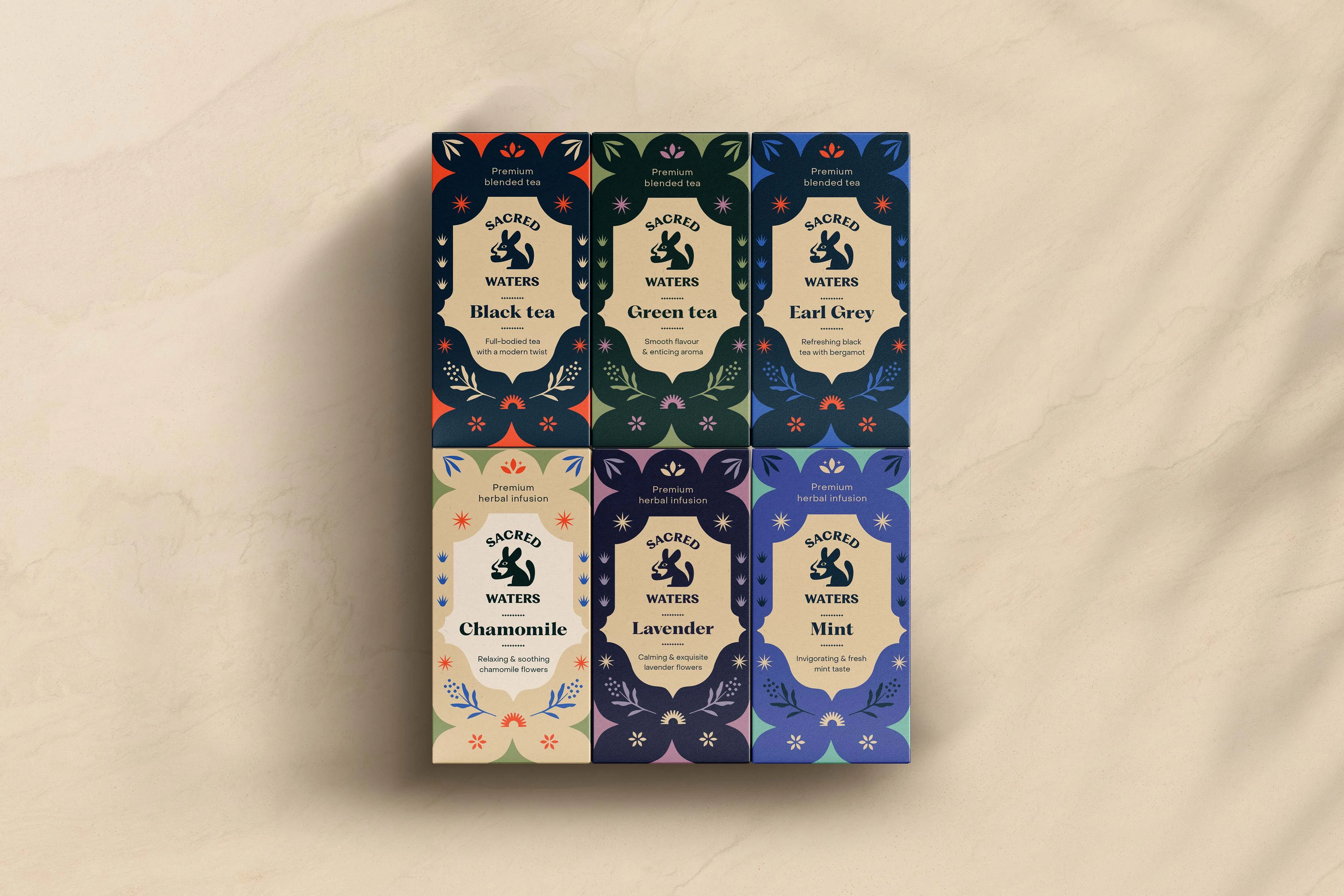
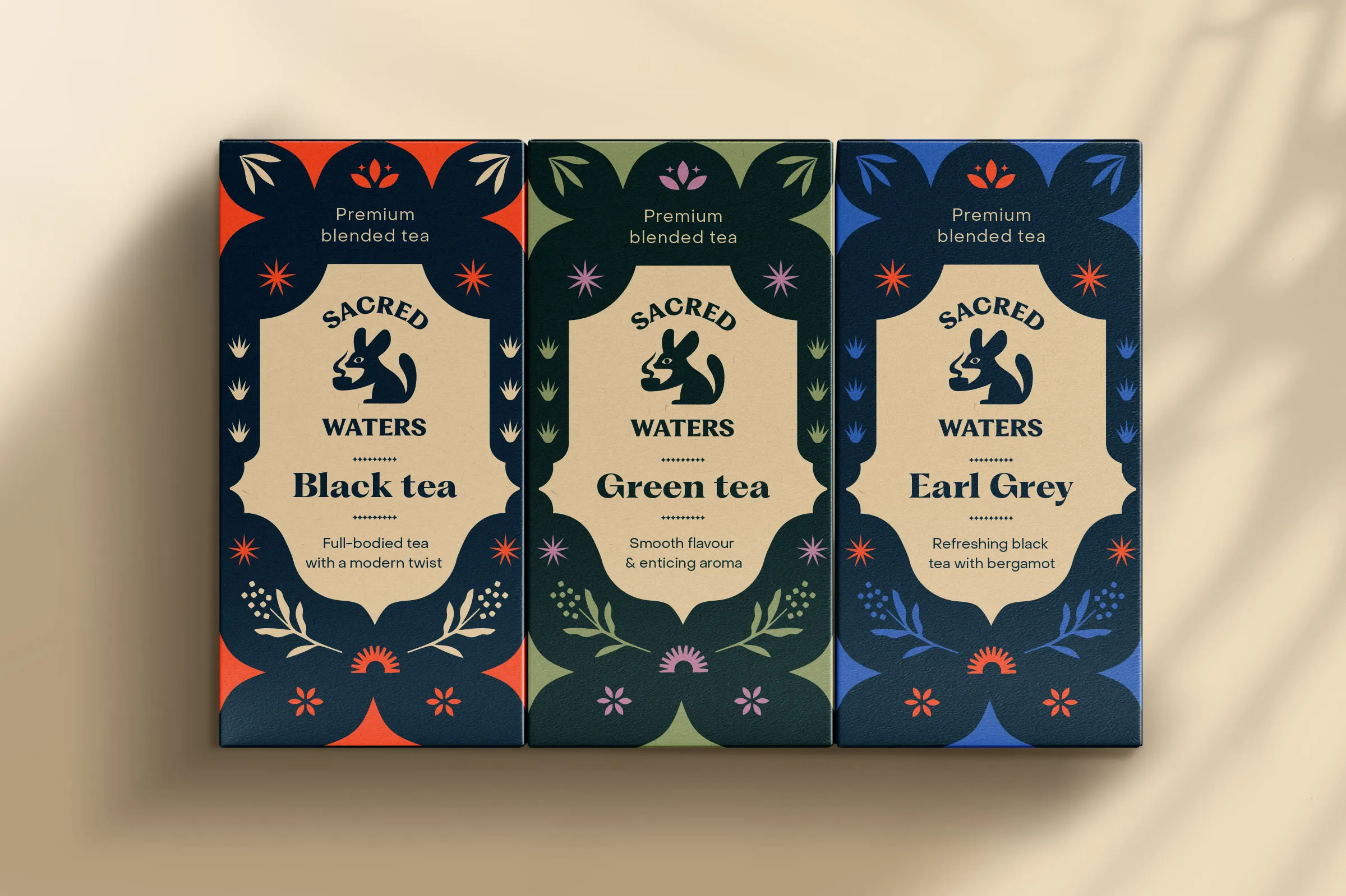
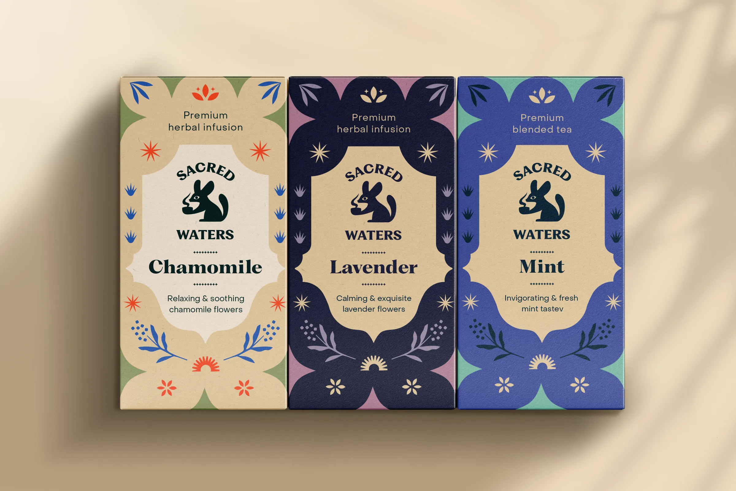
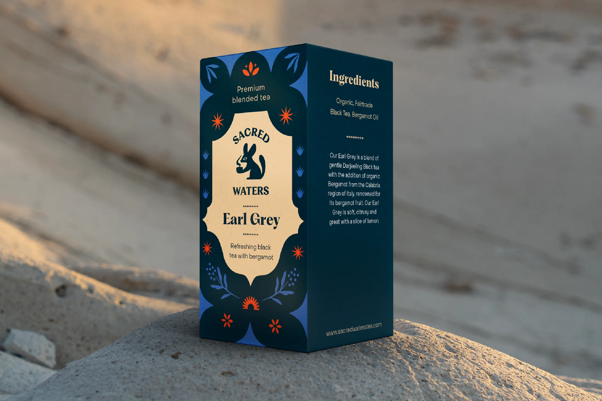
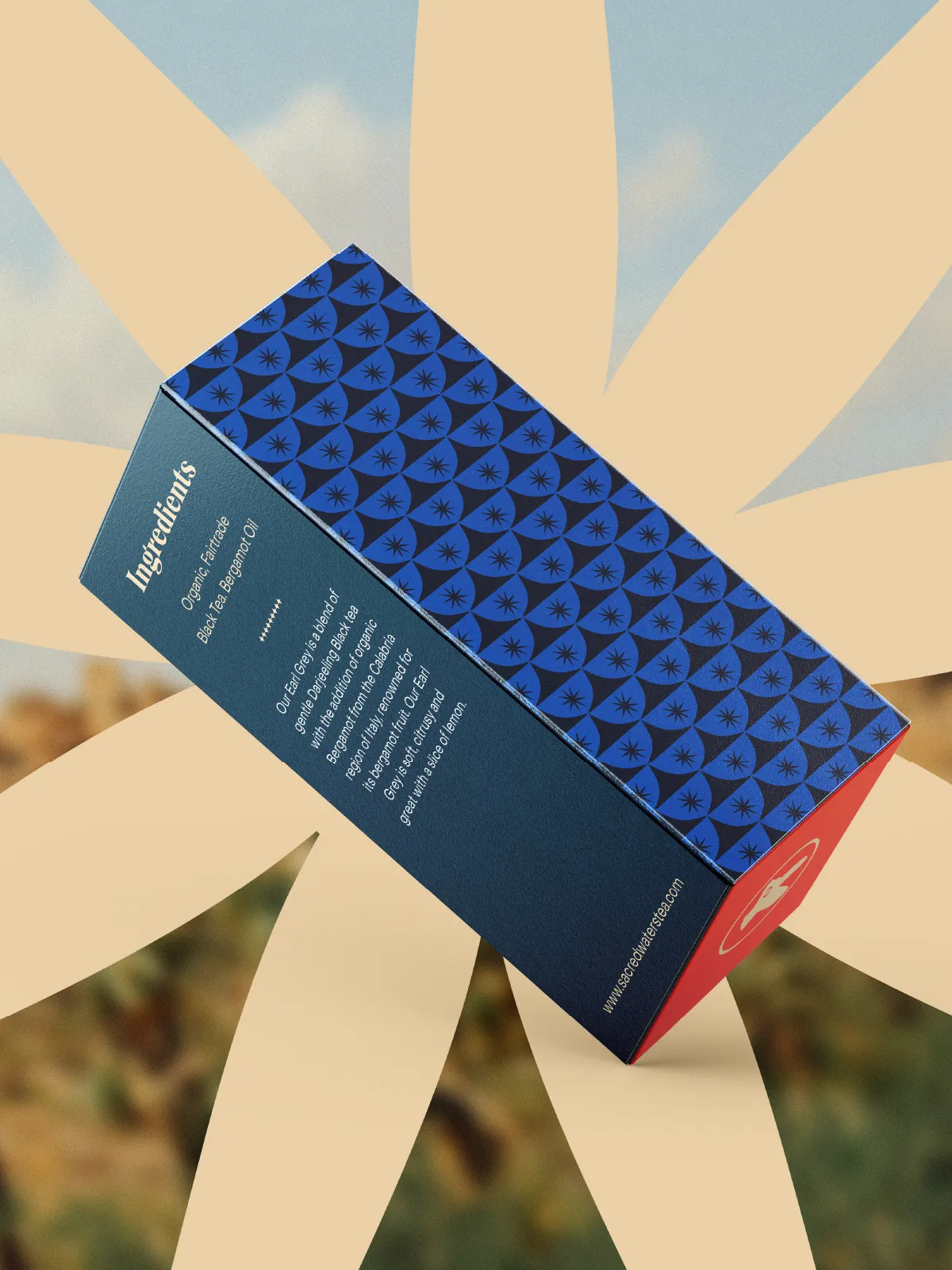
Each of the six varieties has its own color, tied to its flavor or ingredient. The challenge was making these colors work well together while staying true to the creative direction. Cardboard boxes with individual sachets make the tea easy to carry and enjoy anywhere.
Extending the System
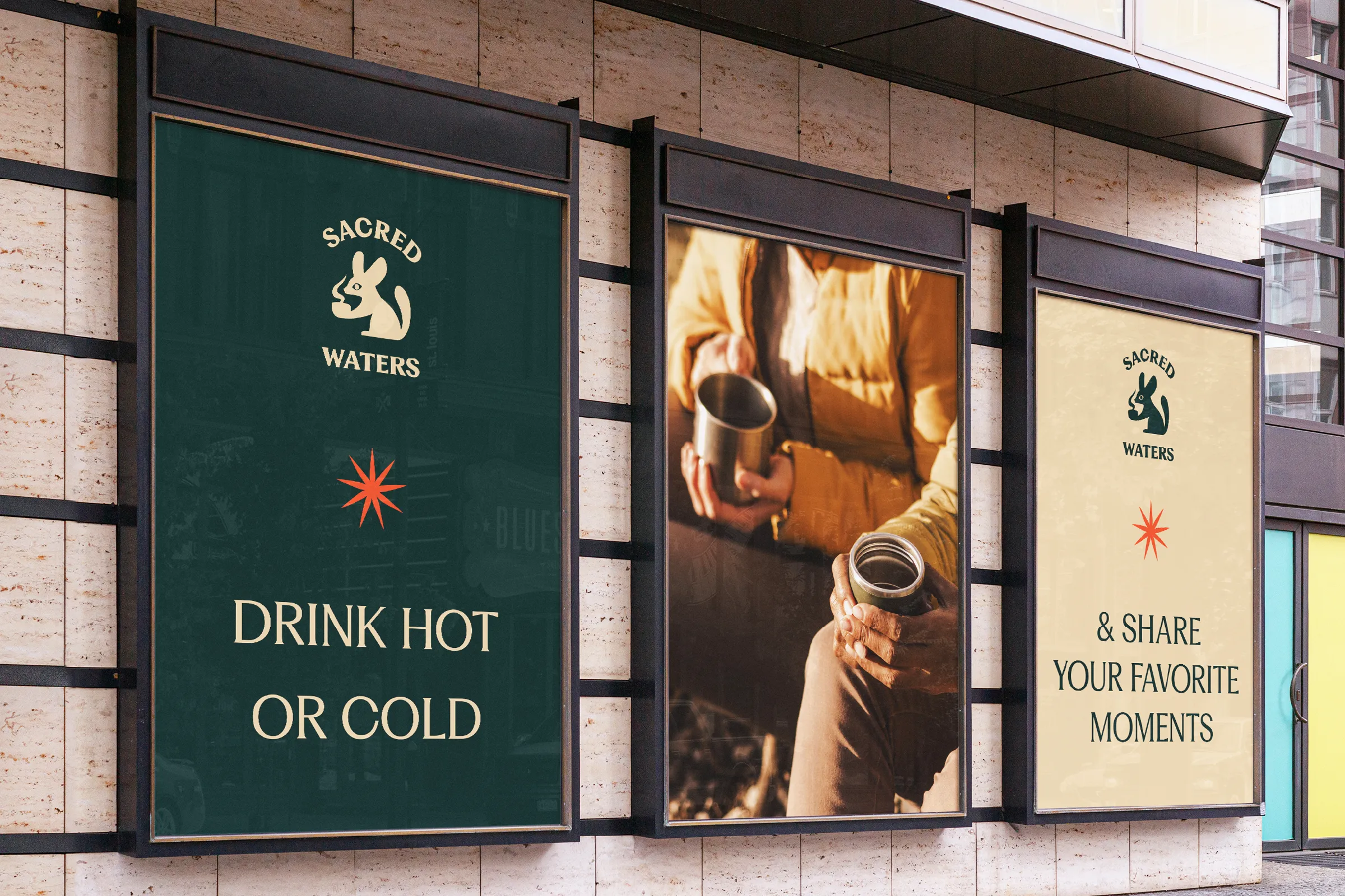
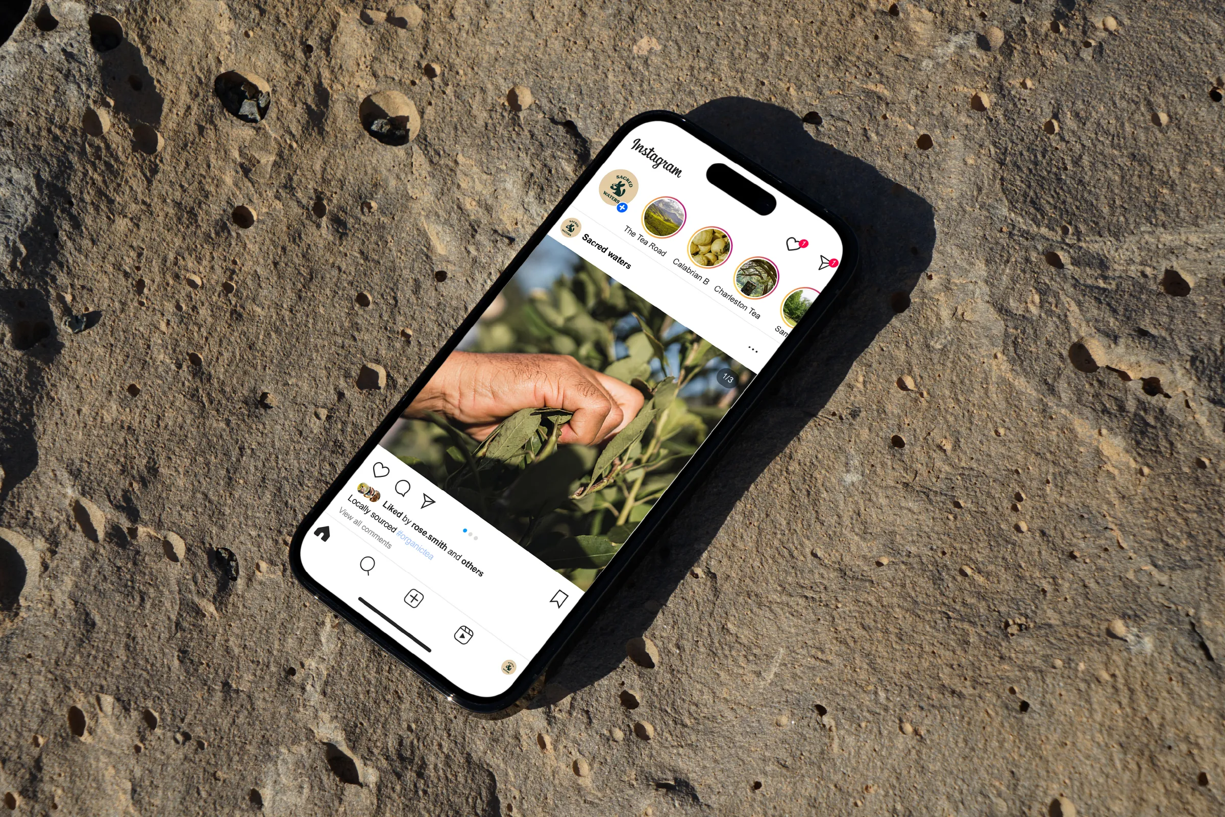
Beyond packaging, the visual system extends across outdoor advertising and digital applications.