DiDi Information Design
- Client
- DiDi
- Role
- Information Design, Visual Design
- Year
- 2021–2022
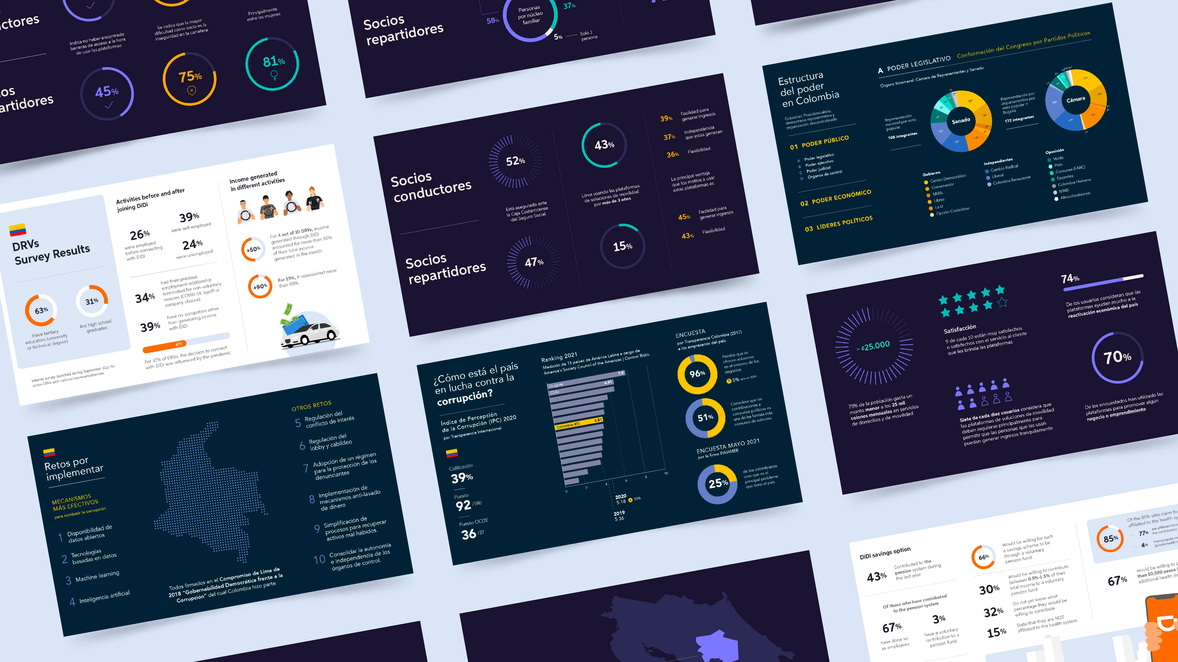
Between 2021 and 2022, I designed a series of data-heavy presentations for DiDi across Latin American markets. Each addressed a different audience and purpose, requiring large volumes of information to be translated into clear, usable visual narratives.
Approach
Each presentation meant turning dense data into clear visuals. Before designing, I identified what mattered, how the information connected, and which format would communicate it best. The visual language then adapted to each audience, purpose, and level of brand presence.
01 — Digital Platform Study Costa Rica
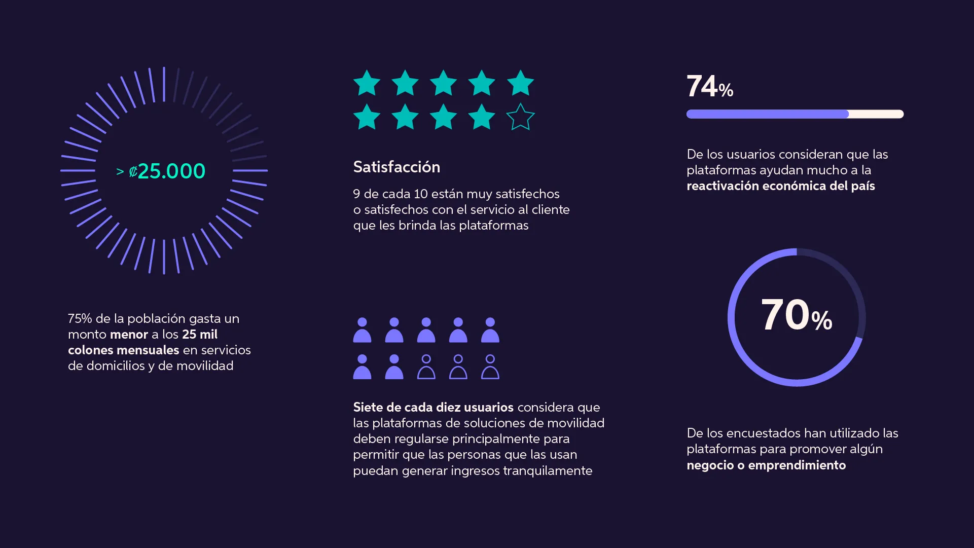
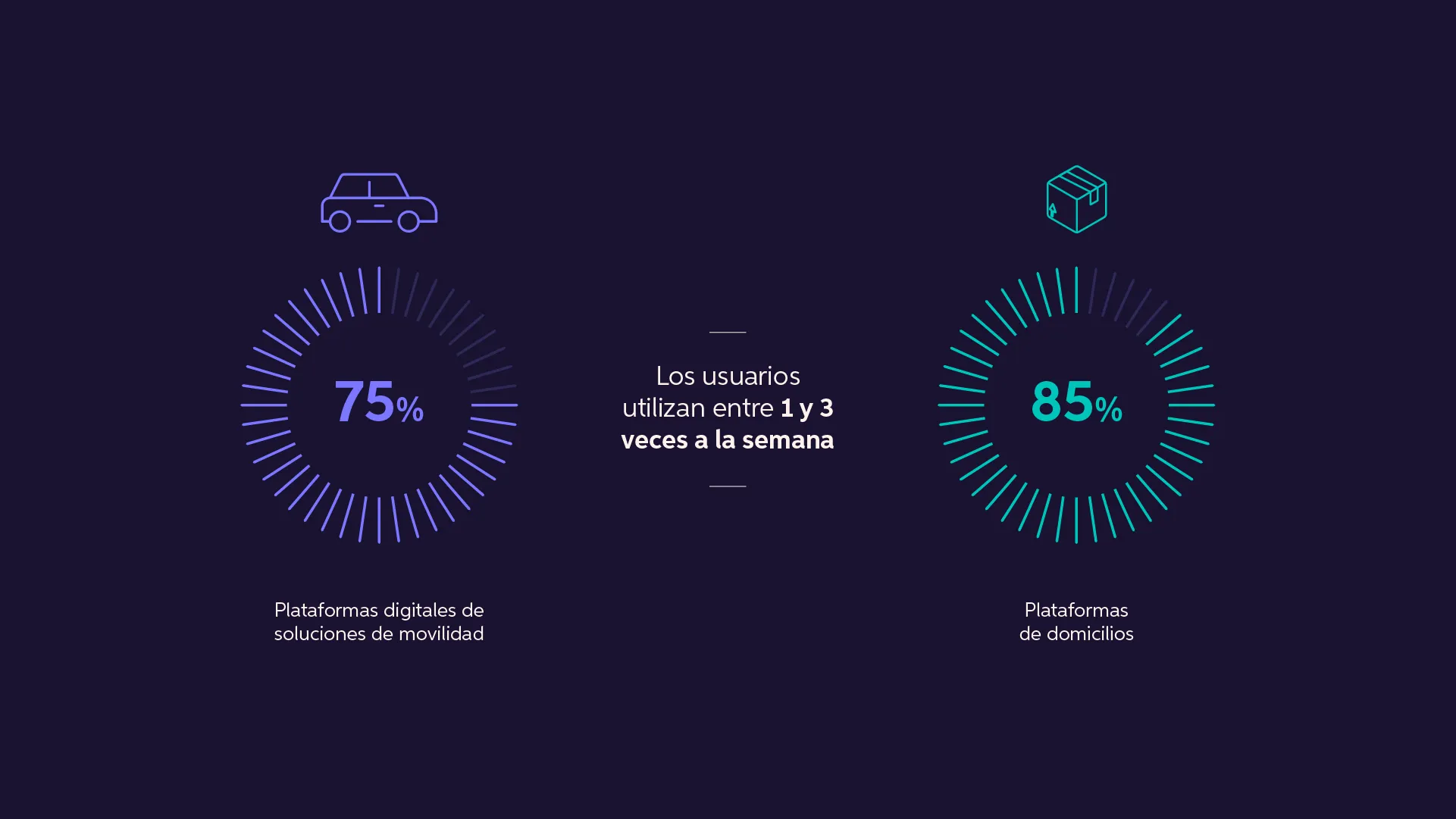
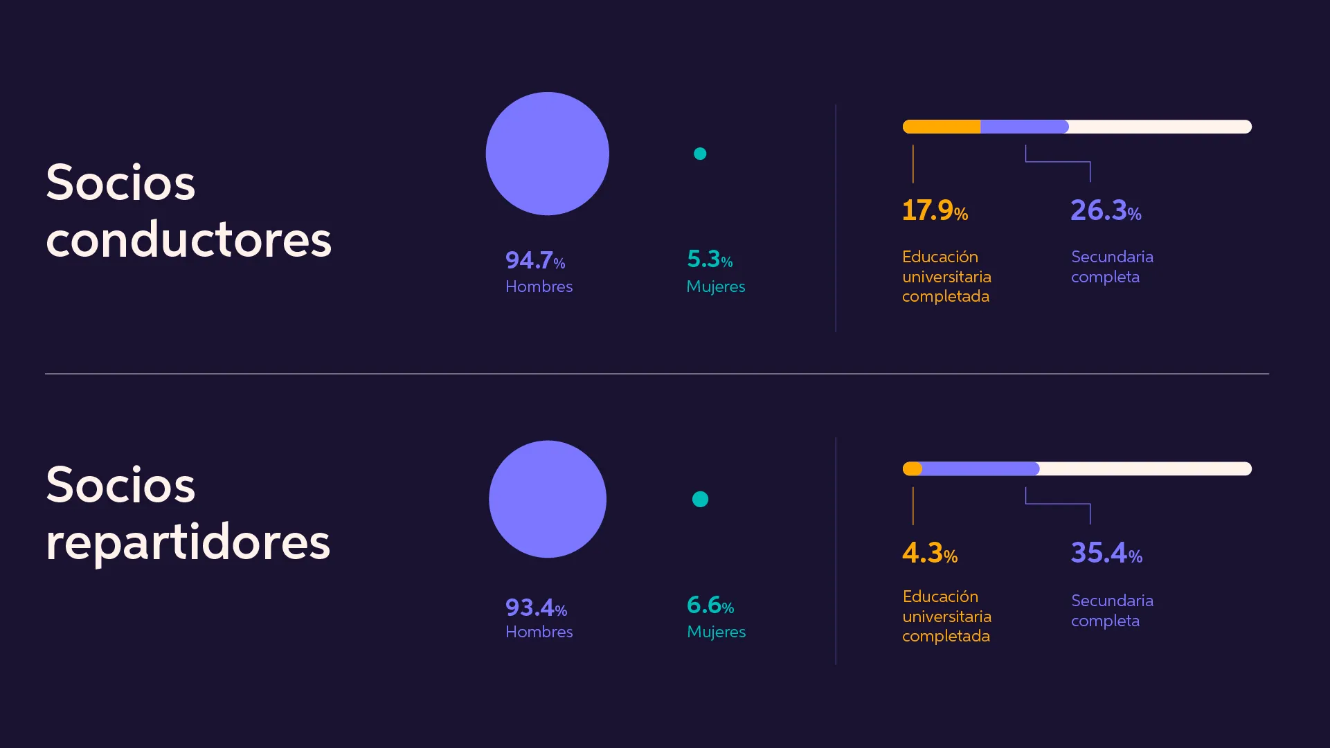
Key findings from an April 2022 study by CID Gallup for the Costa Rican Chamber of Commerce, covering drivers, delivery partners, and passengers.
I structured the data so user groups could be compared at a glance, combining different visualization formats to make the differences stand out. Since this was independent research, I chose a tech-oriented look rather than DiDi’s standard brand system.
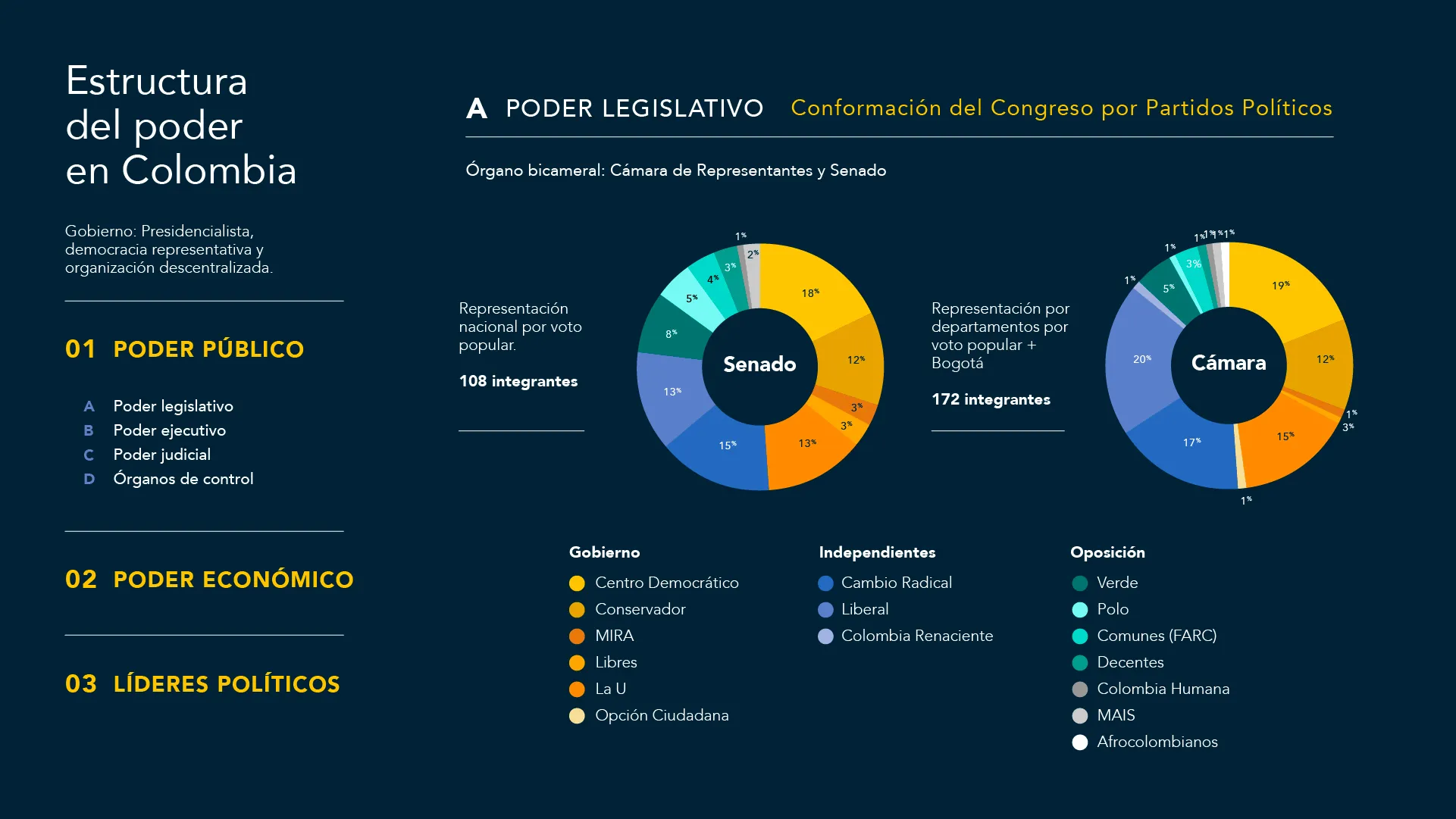
02 — Understanding Corruption in Colombia
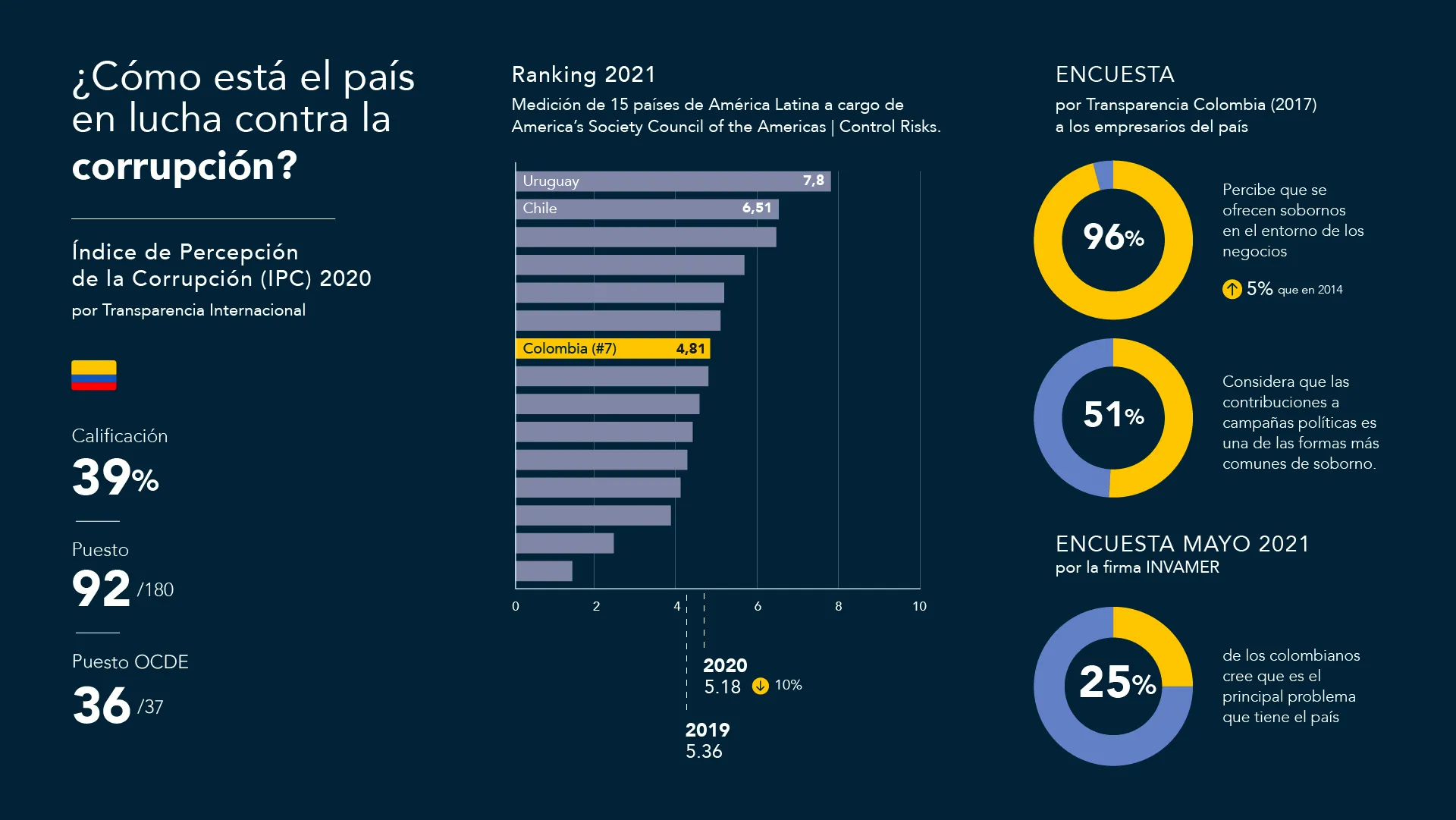
Infographics explaining Colombia’s political and anti-corruption landscape to a general audience.
To make multiple data sources easy to follow, I built a clear hierarchy, used color coding to group related information, and added directional cues to guide readers from key indicators to deeper details.
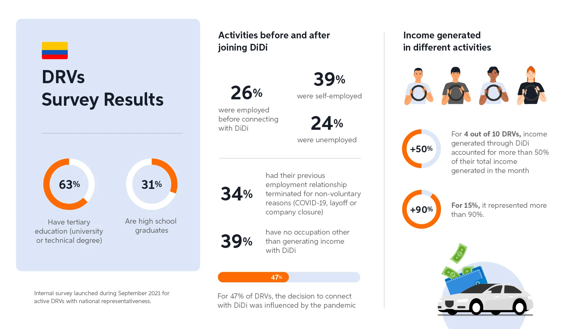
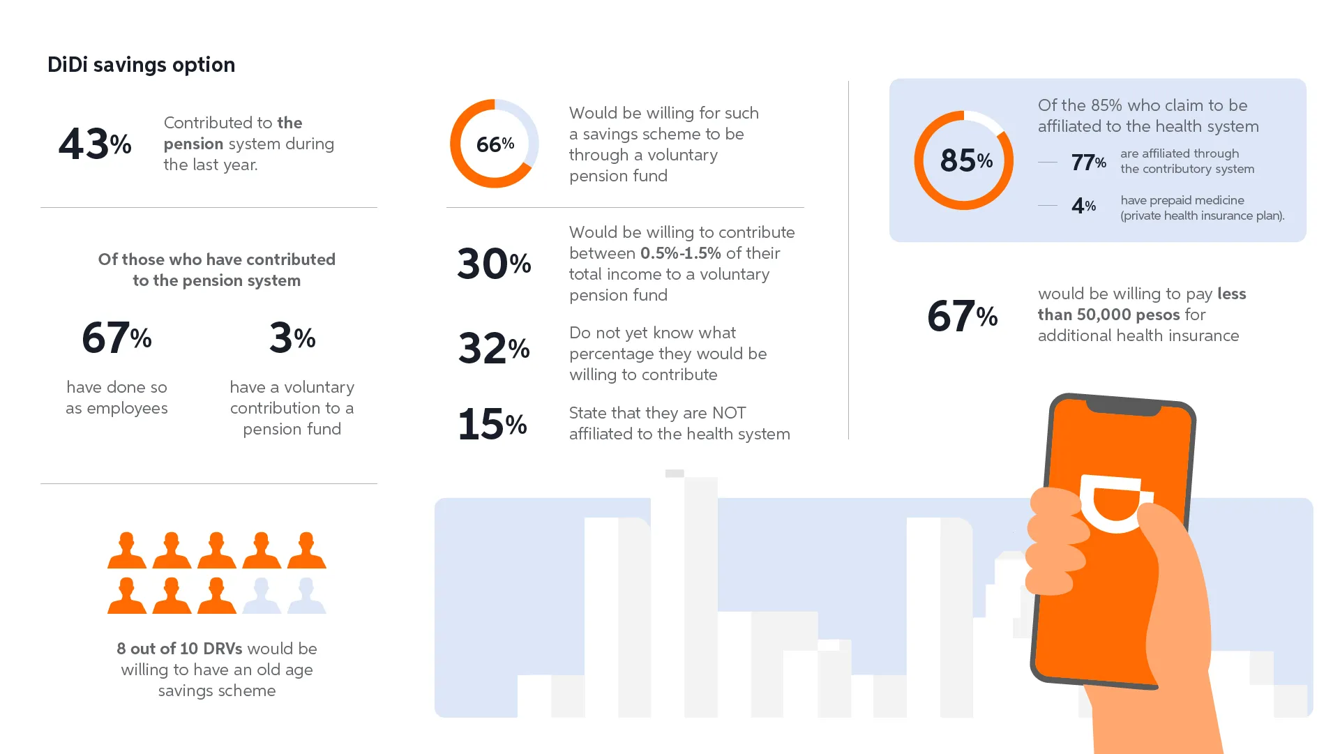
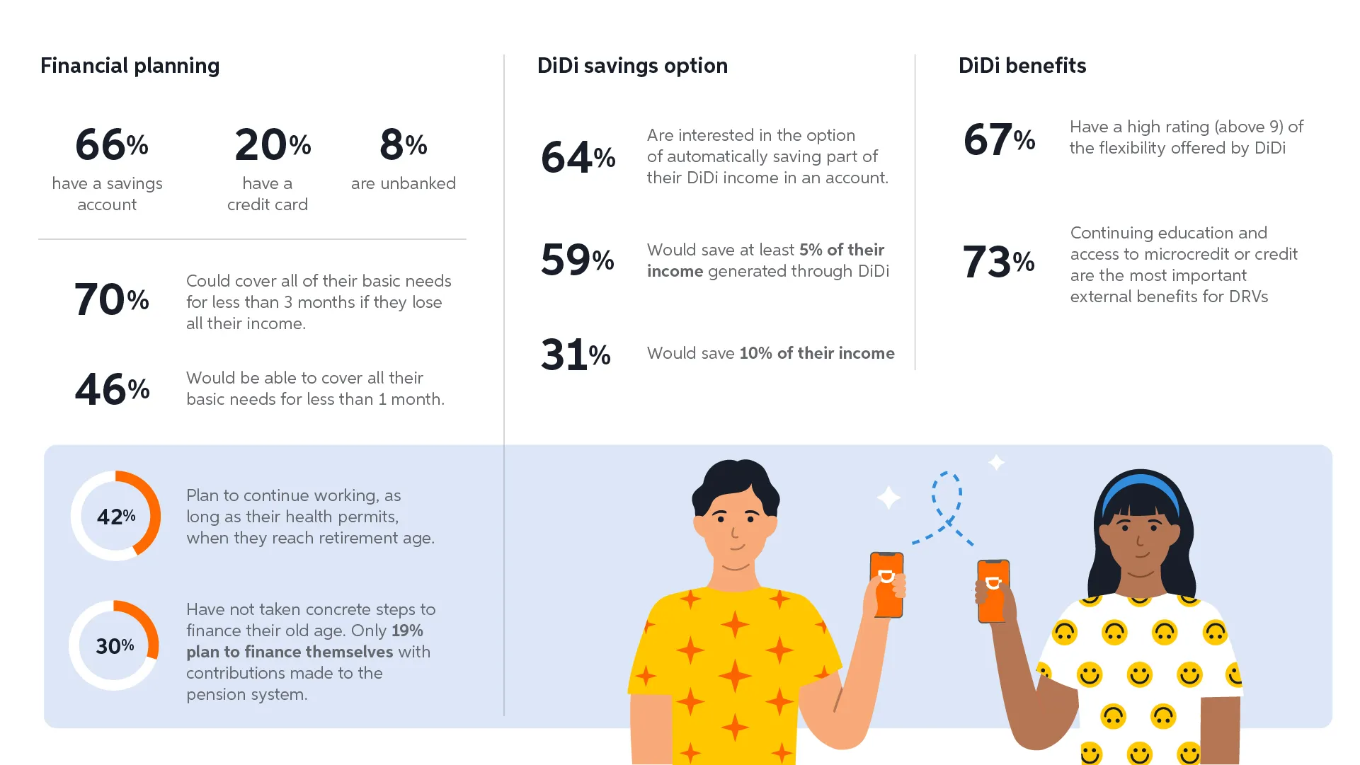
03 — DiDi Driver Survey Colombia
Internal survey results on the financial habits and income dependency of DiDi drivers. Unlike the previous projects, this presentation followed DiDi’s brand system.
Rather than sticking to one chart type, I matched each visualization to the data: human figures for people-based insights, and large standalone numbers when the message was clearer without a chart.