Dentons Event Design Systems
- Client
- Dentons
- Role
- Brand Design, Visual Systems, Art Direction
- Year
- 2024–2026
Dentons is one of the world’s largest law firms, with a highly structured corporate identity. These event design systems translate that identity across conferences, webinars, and internal campaigns, adapting to different themes, audiences, and regions while remaining unmistakably Dentons.
Dentons Brand Guidelines
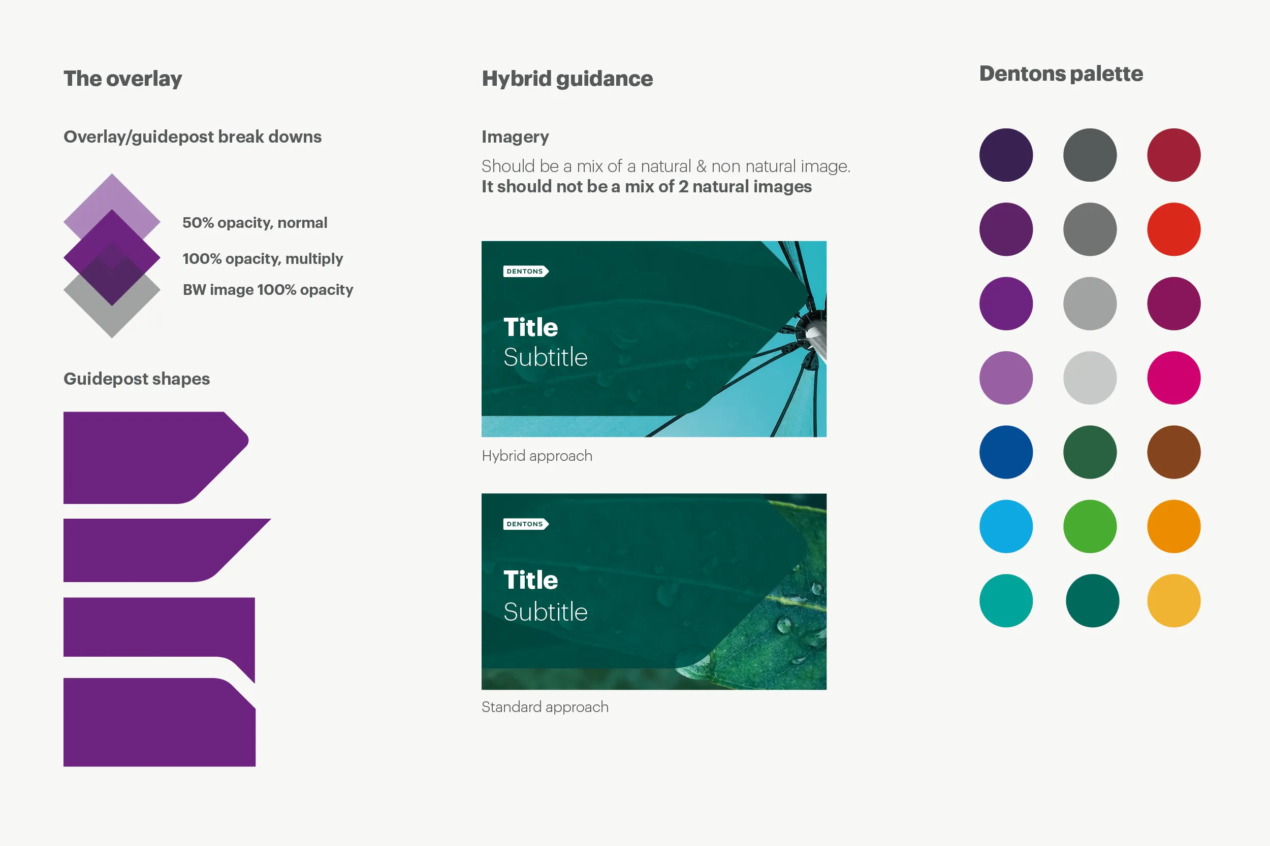
Dentons’ visual identity uses organic and nature-based imagery as its standard approach. When additional context is needed, the hybrid style pairs an organic image with a non-organic one, such as architecture or infrastructure.
Both approaches use Dentons’ signature guidepost shape and overlay treatment, with one image in color and the other in black and white.
Challenge
Each system needed to balance three constraints: remain unmistakably Dentons, create a distinct narrative for each event, and use imagery that felt relevant to its geographic and cultural context.
01 — Out & About 2024
Dentons’ annual internal business development campaign challenged teams across Australia to strengthen client engagement over a month. With connection as the central theme, I explored visual directions that brought together Australian landmarks and local natural elements.
Vibrant Connections
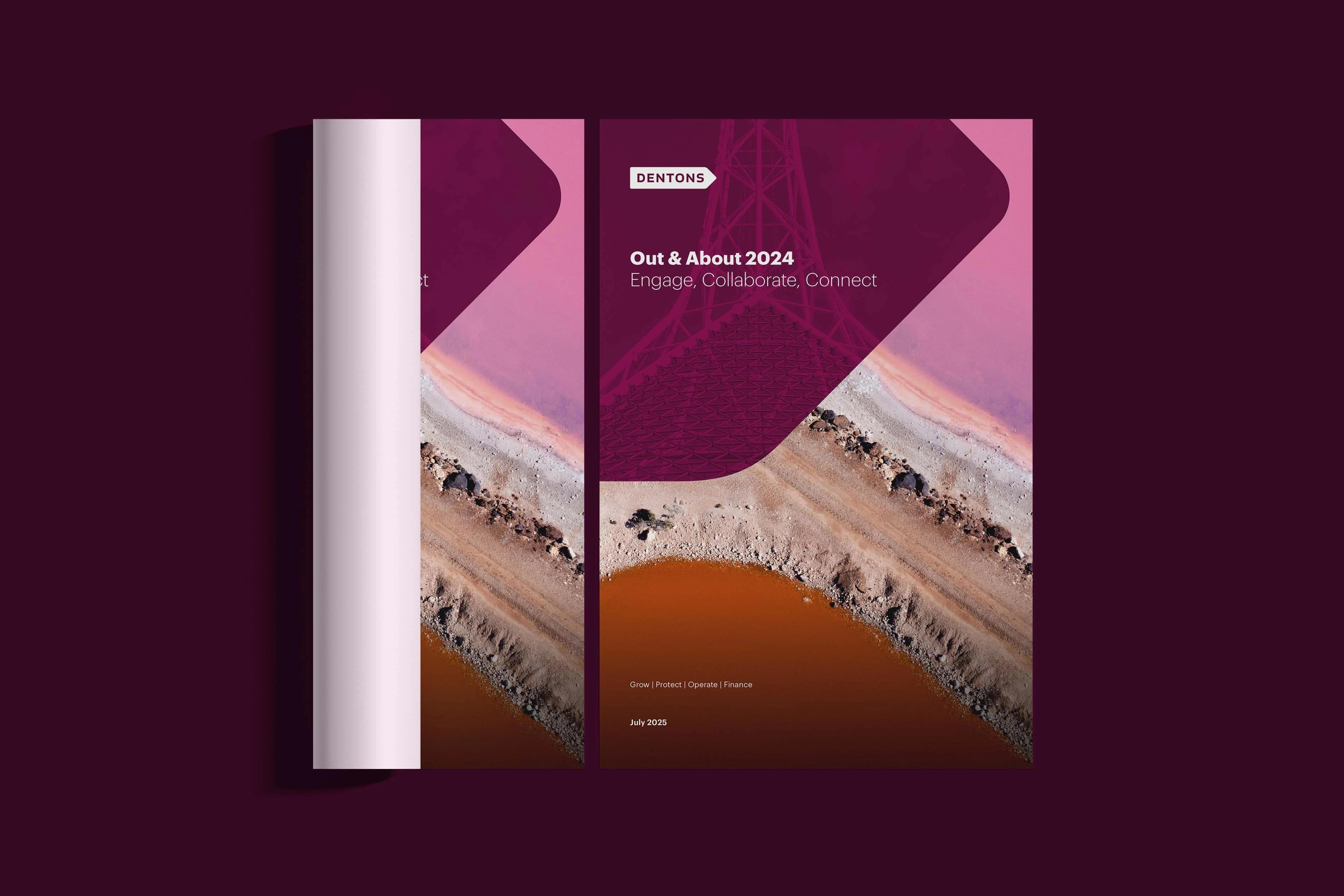
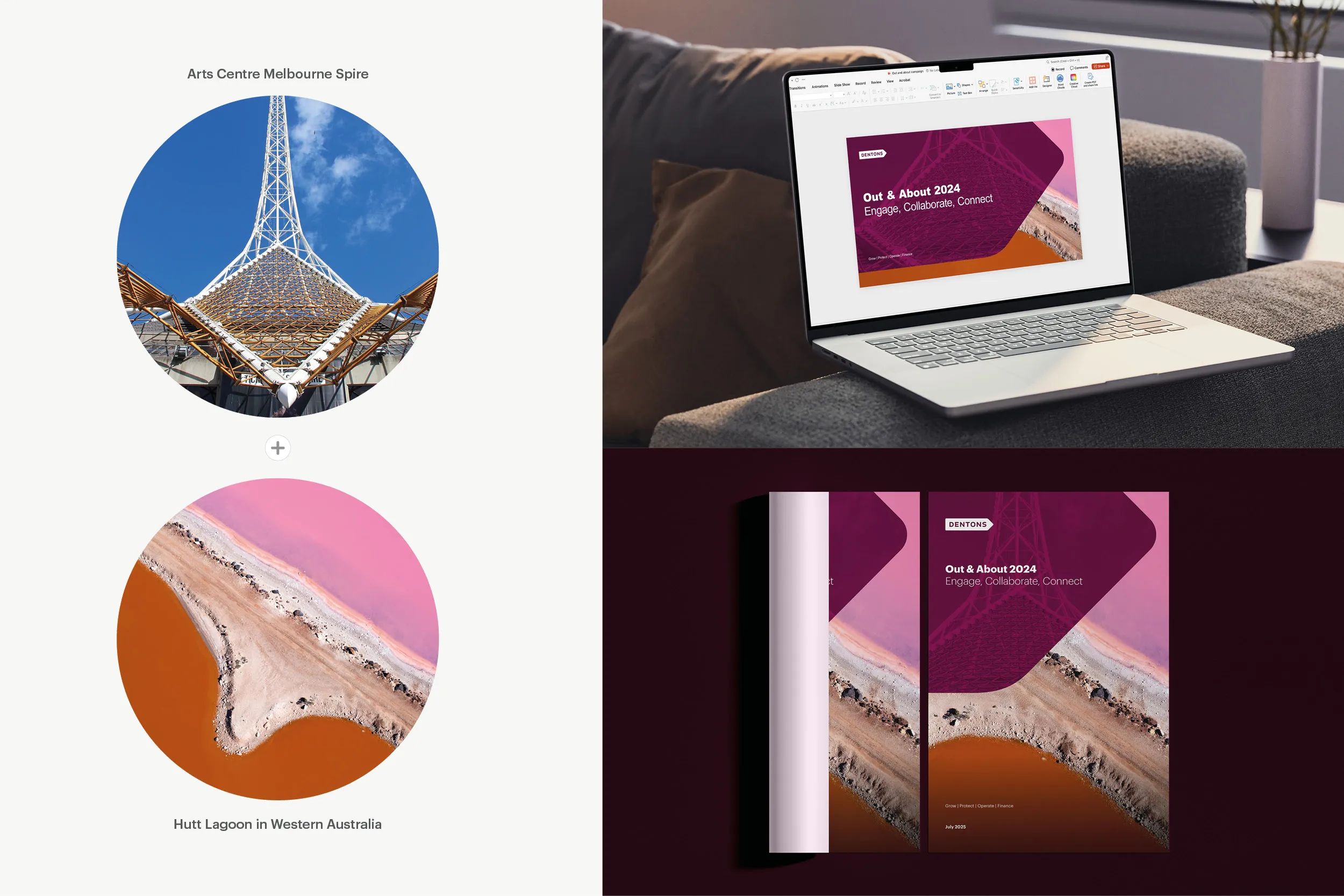
This hybrid direction pairs Melbourne’s Arts Centre spire with Western Australia’s Hutt Lagoon. The spire’s intersecting structure became a metaphor for collaboration and connection, while the lagoon introduced a distinctly Australian organic element.
Bridging Sectors
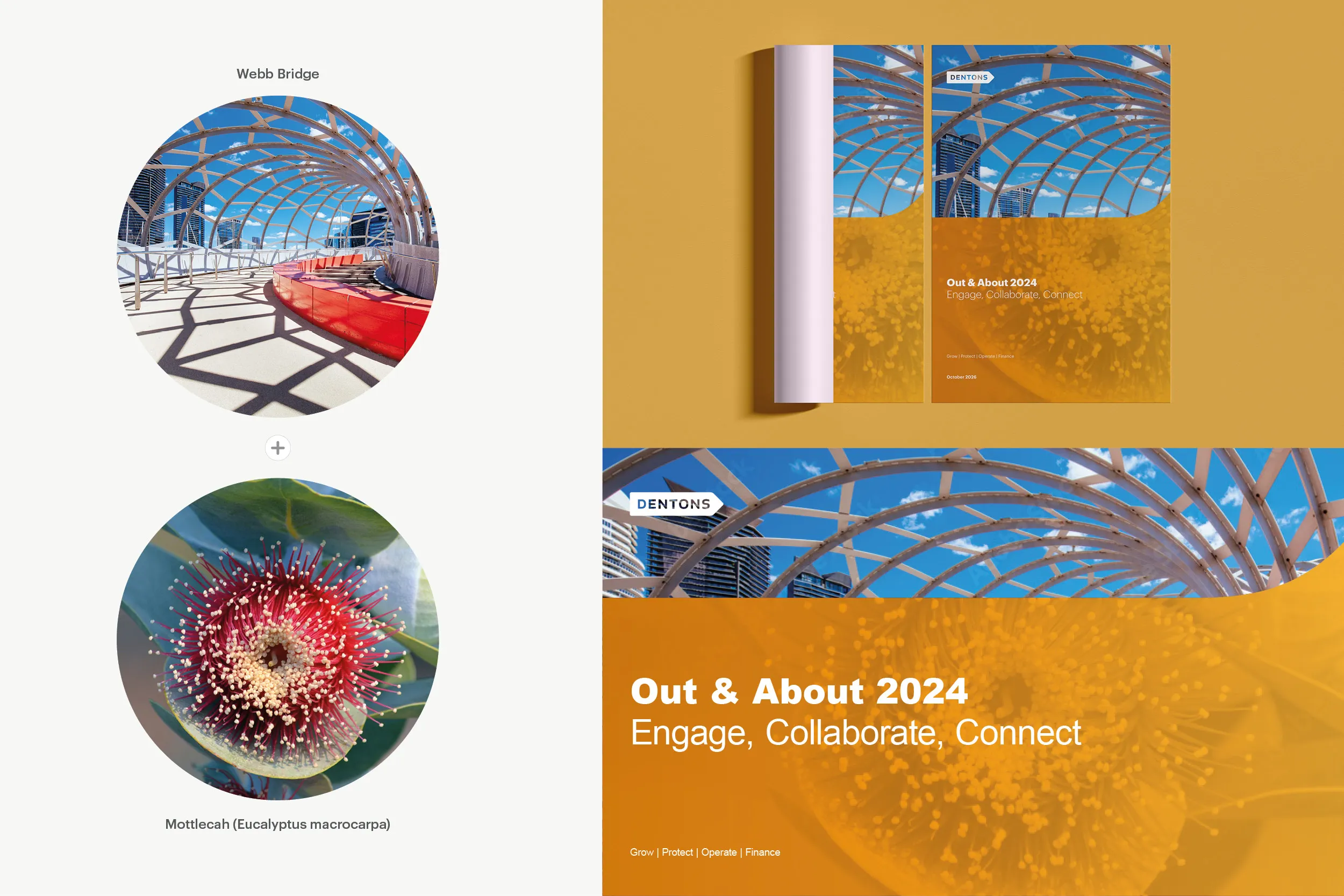
I chose Melbourne’s Webb Bridge as a direct metaphor for connection and paired it with the Mottlecah, a flower native to Western Australia. The Dentons Orange-to-Gold gradient echoes the flower’s warm tones while contrasting with the blue sky.
02 — Webinar on Book Banning
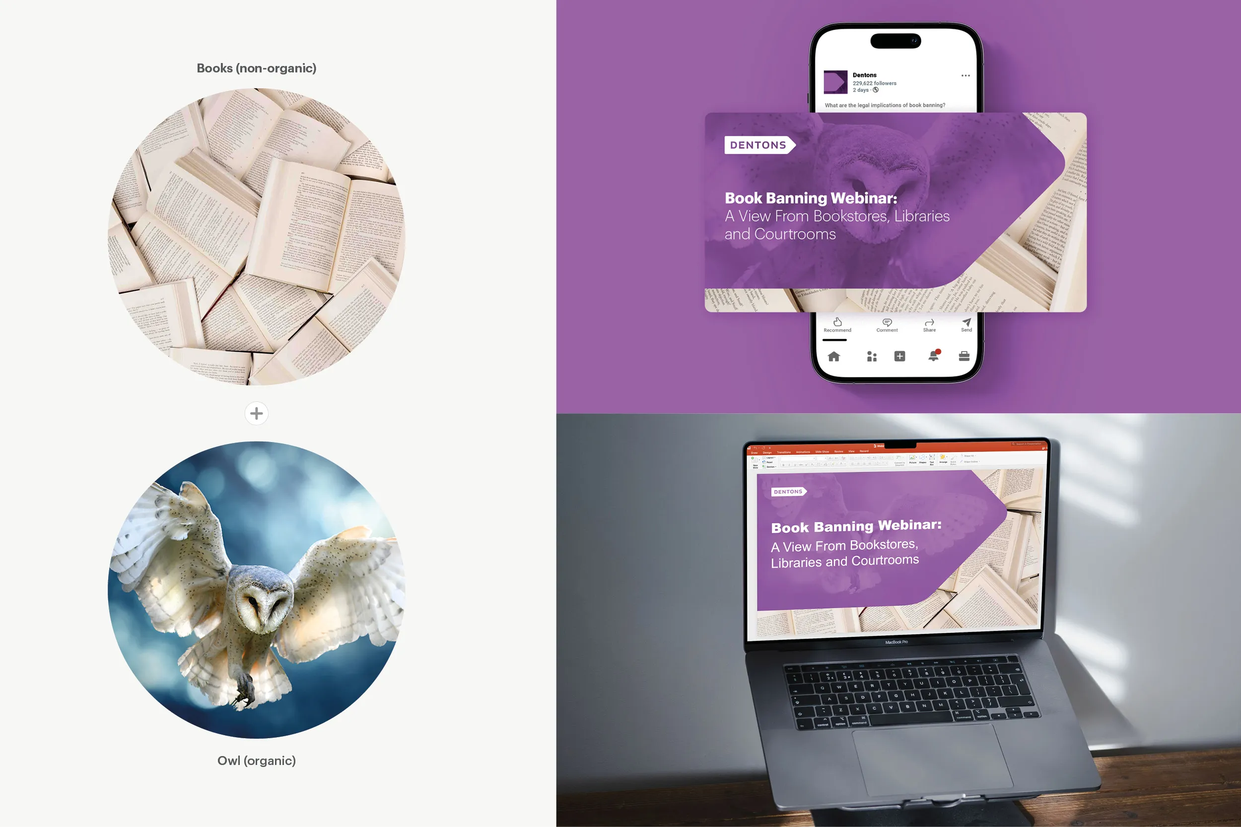
For a U.S. webinar on book-banning legislation, I avoided alarmist or politically charged imagery, using an owl and books to keep the focus on knowledge. Dentons Light Purple ties it back to the brand.
03 — LAC Leadership Committee — London 2026
The event identity needed to translate two business priorities into a visual system: client-centric growth and global integration under Dentons’ “One Firm” model. With London as this year’s host city, I explored these ideas through recognizable local architecture.
Integration and Coordination
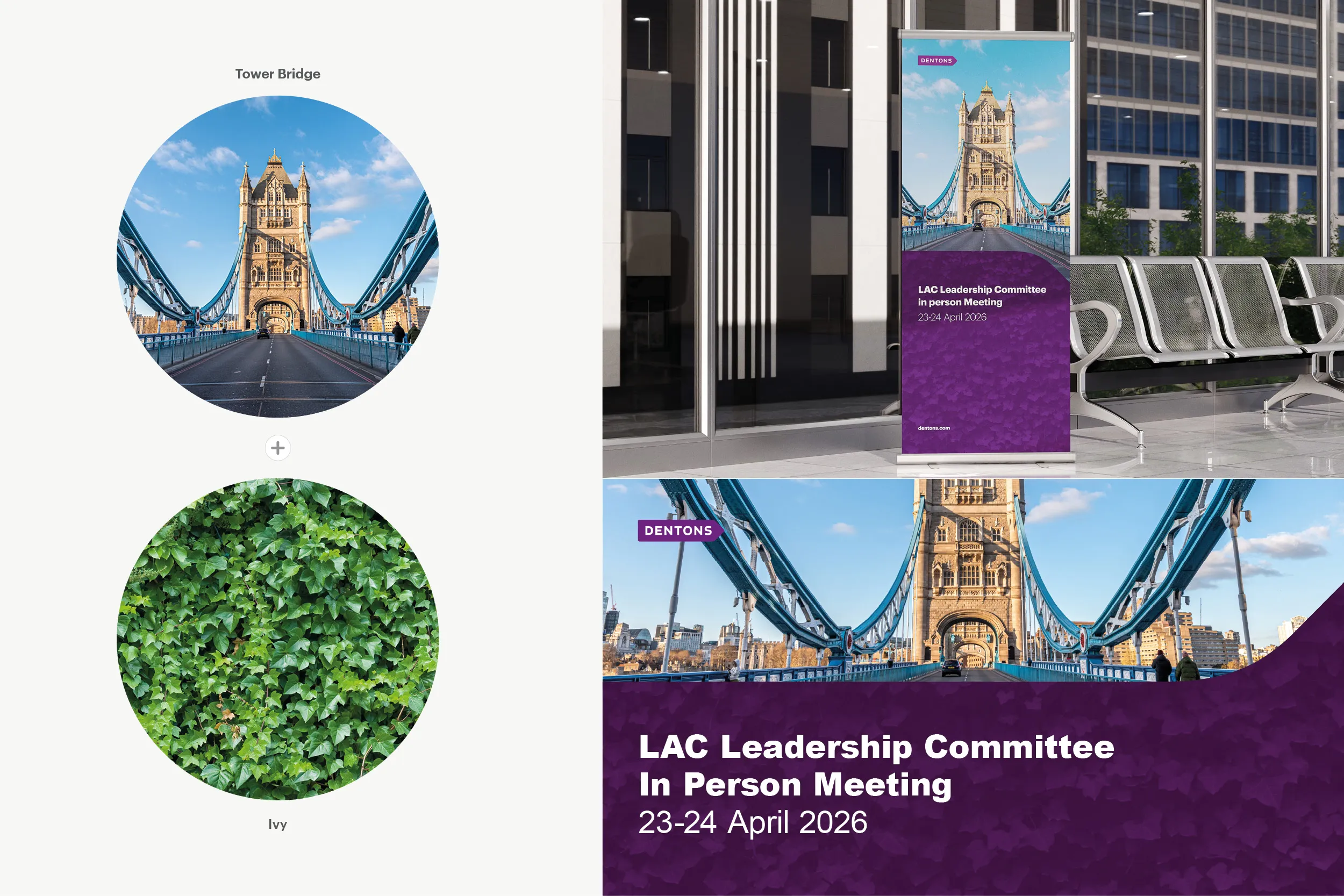
Ivy represents organic growth through connection, while Tower Bridge, a London symbol of linking people and places, adds the idea of bringing regions and markets together. Combined, they form a metaphor for integration.
One Firm: Together in Motion
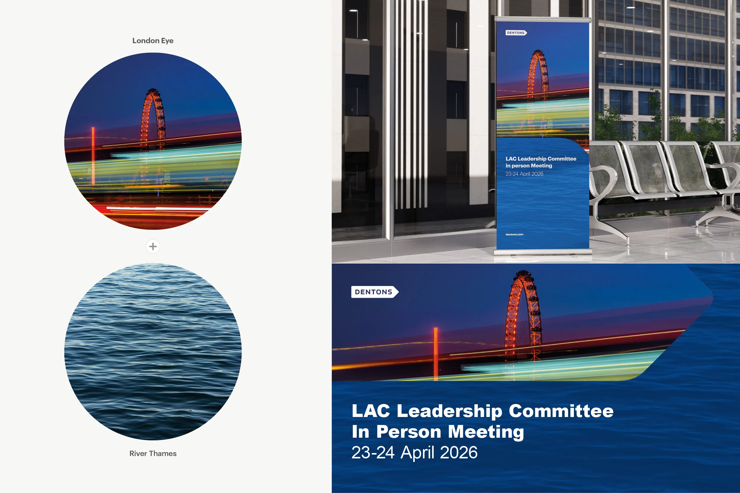
The River Thames symbolizes movement and connection, while the London Eye adds a sense of shared direction. Dentons Dark Blue echoes the river, tying the concept to the brand palette.